
Sorry for the delay… I was playing Half-Life 2 (which is a good game like with Portal) and totally forgot about the last few matches… so I guess I have to write them up…
Like the last digest, blogs will be judged on content and design with content weighing more. Second Page contains the Round 2 Followup. Note that I won’t be doing any digests next round since I have already reviewed all the blogs in the tournament.
Note: Fanart used in this post is made by 竹家ユーキ@待機.
Day 14
Match 25
Kurogane’s Anime Blog vs _____ism
Content: Unfortunately, this match is pretty easy bet. Kurogane’s Anime Blog, although he doesn’t write much triumphs over trolls. If this was a troll vs troll match, ____ism would have win.
Design:
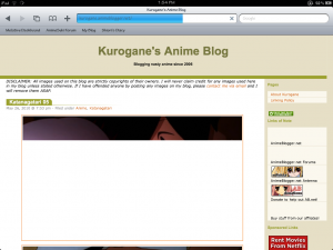
There is not much to say about Kurogane’s design since it looks rather plain. There is no banner either. Another problem I see is a lack of an Archive widget or page. How I’m supposed to look at the older posts?
Match 25 Verdict: Kurogane’s Anime Blog
Match 26
Mono no Aware vs Astrobunny
Content: There isn’t much content in Astrobunny since it usually posting specific things and thats all. In contrast, Mono no Aware’s writing seems to be a lot longer, meaning that there is more substance in the posts, making it an attractive choice. The only downside is that the author doesn’t post very often, but they say…. Quality over quantity… That what I have to say.
Design:
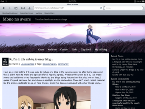
Although Astrobunny’s design looks attractive, Mono no aware has a pretty simple and clean design that looks good enough. The only flaw I see is that there is no category widget, but it doesn’t matter since there is a tag cloud.
Match 26 Verdict: Mono no Aware
Day 15
Match 27
Mainichi Anime Yume vs Memories of Eternity
Content: Pretty much a dead heat since both of these author’s writing are just as good. Mainichi Anime Yume only has a slight advantage over Memories of Eternity over posting frequency. Otherwise, there isn’t much to criticize on content.
Design:
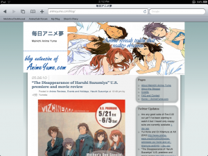
Memories of Eternity has an advantage over this since I find Mainchi Anime Yume’s design a bit… messy. If you noticed that misplaced line on the sidebar, then you know what I’m talking about. I’m sure there are other good WordPress themes that look good without needing to tweak it that much and she should take advantage of it.
Since the tournament shouldn’t be judged on design, Mainchi Anime Yume has a slight lead over Memories of Eternity because of the posting frequency. The content quality is about the same, so there isn’t much to say except that Memories of Eternity should update a bit more often. This is a very tough choice since I had read posts from both of these blogs in the past and the content on them were very good.
Match 27 Verdict: Mainchi Anime Yume
Match 28
SNAG Vs. World vs Eye Sedso
Content: Although SNAG Vs. World has good content, it doesn’t appeal to me much. Eye Sedso’s posts compared to other blogs can be amusing. Otherwise, this is a match over preference.
Design:
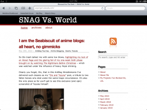
There isn’t much I can say, but it certainly looks dull since there is no banner or anything. Although it looks okay, It would looked better if it had a banner. Eye Sedso’s banner is pretty creative. SNAG Vs. World simply needs a bit more creativity in its design since it means everything besides the content, which is more important.
Match 28 Verdict: Eye Sedso
Day 16
Match 29
Blogsuki vs Unmei Kaihen
Content: Unmei Kaihen is a strong episodic blogger and BlogSuki? The author is a big Mio fanboy as proven by lolikitsune saying that this post isn’t Anime blogging. Besides from that, there isn’t much to say about the content since after that incident, Unmei Kaihen looks more professional, which doesn’t mean BlogSuki is a bad blog… but too much Mio fanboyism…
Design:
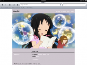
The design on BlogSuki is frustrating. It only views one post at a time… but what happen if I want to view more than one post… Oh dear…
Tip for all people: Never use a design that only show one post at a time… I don’t feel like scrolling down and click next just to read the post I want to read.
Match 29 Verdict: Unmei Kaihen
Match 30
Bokutachi no Blog vs The null set
Content: From the last time I reviewed The null set, it apparently sprung out a higher posting rate after being somewhat inactive for a while. Bokutachi no Blog is a team episodic blog and while I find their posts pretty good at a good posting rate over The null set, they do metablogs, but that isn’t really content since it’s a compilation of opinions, not the author’s opinions. A good thing that they didn’t to that many metablog posts. Otherwise, Bokytachi no Blog has a slight lead over The null set over posting frequency. The null set really need to put out other content instead of a flood of impressions post.
Design:
As both of these are WordPress.com blogs, so I won’t go that in detail in the design aspect. The only problem with The null set’s design is that it doesn’t look very nice. I’m sure there are better designs, but they are pretty much limited on what WordPress.com provides, which puts most of these blogs at a less of an advantage against self-hosted WordPress blogs that can take advantage of the vast number of WordPress themes out there.
Match 30 Verdict: Bokutachi no Blog
Day 17
Match 31
Atarashii Prelude vs Desu ex Machina
Content: Shin is a hilarious editorial poster and there isn’t much to say on that. He focuses primarily on editorials and thats it. However, kevo’s posts are more interesting and since he posts more frequently, the advantage goes to him.
Design:
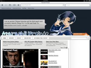
Although I liked Atarashii Prelude’s design, it doesn’t view properly on the iPad like with hontou ni mentioned in Part 2 of the Round 2 Digests. My suggestion is get rid of the date outside of the layout and put it inside the content area since the iPad doesn’t like this… or even 1024×768 screens.
Match 31 Verdict: Desu ex Machina
Match 32
Anime Diet vs Anime Princess
Content: The content from Anime Diet simply doesn’t appeal to me unlike Anime Princess. Although she posts not as much, her post quality is pretty good.
Design:
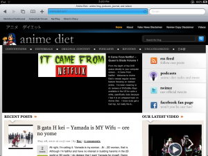
Although the design looks okay, there is a lot that is going on with the layout… so much, but it views properly on the iPad. It’s more like form over function… since it looks nice, but not as practical.
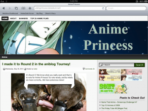
Last time, I harshly criticized her for her design in the last round. I have to say that the improvements I suggested have drastically improved the design of the blog. Although not nearly as nice as Anime Diet’s, it looks clean and less intimidating to readers since it’s not too fancy.
Match 32 Verdict: Anime Princess


Round 2 also gave me lots of surprises. Among them were Hanner’s victory over Ghostlightning and the Janai/RP tie. Oh, my blog getting pass Wakaranai still baffles me till this day. Random C…I don’t think it won because of the contents but because of its large silent readers.
On a side note, I’ve been reading you for a while a decided to add you into my blogroll. I’ll be really happy if we share links 🙂
.-= Canne´s last blog ..Training your Dragon and Beast Lord: a short discussion =-.
Done…
I still wonder how the three way battle will turn out… Probably the first in the tournament. :p
I wonder what your record is for picking winners…I feel like you’ve been pretty dead on with most of your picks.