When I really need to do these digests, I forget now since I have no classes at the moment. It was a week and a half since Spring Semester ended, so I will try to roll these posts a bit more quickly than what I am doing right now.
Like the last digest, blogs will be judged on content and design with content weighing more.
Note: Fanart used in this post is made by 悠夜
Day 10
Match 19
There was some drama like last time that caused AstroNerdBoy to withdraw from this round, making Mistakes of Youth the automatic winner. However, I don’t want to be unfair to Mistakes of Youth by not reviewing it, so I will review it anyways.
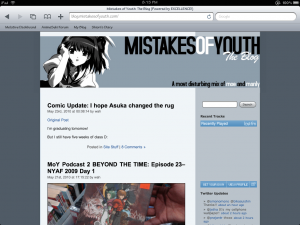
Mistakes of Youth is an editorial blog and the posts seems rather interesting. In some instances, the author posts art, which is okay, but not much content in those posts. However, the problem I see is the layout since it looks bland. The background color on the right makes the text slightly hard to read on the screen, although it’s readable on the iPad screen. Also, the footer text looks a bit awkward because of the two colors in the content area and sidebar. It makes it look like its off center. Otherwise, not bad, except the design that needs some improvement.
Match 20
Drastic My Anime Blog vs GAR GAR Stegosaurus
Content: This is a very tough decision. Both of these blogs pump out very interesting content and they post about the same rate… Since GAR GAR Stegosaurus is a bit familiar to me, the match goes to her… but in consideration, Drastic My Anime Blog will probably end up on my Google Reader along with GAR GAR Stegosaurus.
Design: Can’t comment since both of these blogs are WordPress.com blogs.
Match 20 Verdict: GAR GAR Stegosaurus
Day 11
Match 21
Omonomono vs Fuzakenna!

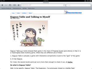
Both of these blogs have comparable content with Fuzakenna! having more attitudes in their posts. Omonomono is a bit more professional looking overall. The varying differences are the design that will break this tiebreaker. Fuzakenna! has an advantage over easy navigation and Omnomono being readable. The problem with Omnomono’s layout that it looks so plain and there isn’t much color. It feels like I’m reading an e-book on iBooks or Kindle, not reading a blog. More colors would help…
Overall, both are great blogs, but Omnomono really needs to get a better WordPress theme as the one they are currently using looks bland.
Match 21 Verdict: Fuzakenna!
Match 22
Josh’s Anime Blog vs Oishii Anime
Again, this is another tough decision I have to make. Both have good content, but my only complaint with JAB is that its episodic posts have slightly too much summary, although he is trying to cut it down, so I won’t use that point against him. Otherwise, his content overall is good. Also, I like the design of JAB as it’s very easy to navigate and looks good. I also commend him on his effort of reviewing the blogs in the tournament as that takes a lot of time.
On the other hand, Oishii Anime has a lot going on the layout. I didn’t mention this in my last review in Round 1 because I was strapped for time. By looking at JAB’s design, OishiiAnime navigation simply looks too complicated and intimidating Although it looks cool, I would rather have an easy to navigate layout like I seen with other blogs I subscribe to. My suggestion is to start from scratch using Thematic and work her way up so she will have a simple and easy to manage design. Content is good, but the layout needs improvement.
Match 22 Verdict: Josh’s Anime Blog
Day 13
Match 23
Reverse Thieves vs Koji Oe
I have absolutely no interest in Koji Oe’s writing, so the vote automatically goes to Reverse Thieves, because their content is rather good. My question to them… If you have a domain name, why host on WordPress.com because it limits you on customization and plugins? Just wondering because the design looks rather dull. I’m sure you can be more creative if you were on a self-hosted WordPress than being hosted on WordPress.com.
Match 23 Verdict: Reverse Thieves
Match 24
Hashihime vs ∑Xce7ion
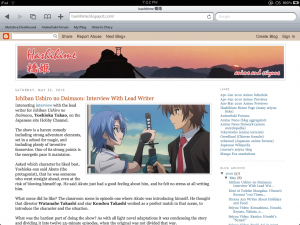
Content: Hashihime mostly posts stuff about Seiyuus. The advantage over ∑Xce7ion is that it’s frequently updated. The latter still haven’t updated for a month, so it’s a automatic strike against the author as I mentioned in the last round, which is why I didn’t vote for him and I won’t vote for him this round unless he starts putting more effort in his blog.
Design:

The design of Hashihime is clean and simple and easy to navigate. Although ∑Xce7ion design looks nice, the author still didn’t get rid of the stupid and annoying Wibiya bar, which is completely unnecessary, and it’s another strike against him. These bars are completely unnecessary for these types of blogs and they should never be used. Not only that, mobile devices do not like these toolbars .
Match 24 Verdict: Hashihime
Thats wrap up Part 4 of the Round 2 Digest. Hopefully, I will have the next one out tomorrow or the following day.


I would have liked to have stayed in, but Psycho’s tainting the voting meant that it was unfair to both myself and to MoY. I hope that if they do this again, proxies aren’t allowed to vote.
That is pretty nasty and unfair. Sometimes the Internet can be a very nasty place, but I didn’t expect people in the anime blogosphere to act like this. It disgusts me really as those unfair voters and campaigners in those matches were acting like children, I’m guessing this is come thing that the organizers need to address in the future.
We were hosted elsewhere previously but had a lot of problems with the WordPress software, after a couple of years of annoyances, I got fed up and moved it over to WordPress.com. Sorry you don’t like the design, but it is designed, it isn’t just a template.
That’s fine… As the content is more important. :p