Summer fever sets in and I totally forgot yet again… Oh well!
Not summer yet, but close to it… Like the last digest, blogs will be judged on content and design with content weighing more.
Note: Fanart used in this post is made by ミサコズ.
Day 7
Match 13
Karmaburn vs Major Arcana
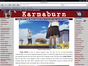
Content: Definitely going to be a preference battle with this match as it is episodic vs editorial. Although the writing on Kamaburn is fairly good, but they do not allow any commenting what so ever which is a big negative on their part. Blogs that don’t have commenting such as the Anime Almanac as another example as not allowing discussions. It just proves that the author can’t take any criticism or discussion of any kind. On the other hand, I find Major Arcana’s editorials rather interesting, so they pretty much win on content. Also, they allow commenting. A blog that doesn’t allow commenting on their posts will always be the weak one.
Design:
Again, Major Arcana wins on this one as they aren’t as cluttered as Karmaburn. Karmaburn has way too much going on with their layout. Instead of listing every old review on the sidebar, why not just put them on a separate page? Another thing is that they should put the categories in a drop down because who wants to scroll down to the category the reader wants to view. Their design doesn’t help the fact that they do not allow comments.
Match 13 Verdict: Major Arcana
Match 14
Mega Megane Moe vs Mecha Guignol
Content: Mega Megana Moe is what the name says… obsess about moe, ISML and other stuff along with obsessing over characters, especially Shiori and Izumi… Sadly enough, he doesn’t post very often… so contentwise, the advantage go ever so quickly to Mecha Guignol although I have no interest in their content.
Although, CCY’s 12-day project was pure gold and pretty much something that haven’t been tried in the blogosphere before…
Design:
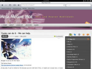 Can’t comment on the design on Mecha Guignol since it is a wordpress.com blog. However, Mega Megane Moe’s design is pretty appealing to the eye, but nothing else could be said about it.
Match 14 Verdict: Mecha Guignol
Day 8
Match 15
THAT Anime Blog vs Ani-Gamers
Content: THAT is like with Sea Slug I have reviewed earlier in Round 2. Not only they do episodics but they also write editorial posts. Both of these posts are well written and have a lot of energy. Ani-Gamers is a good blog too, but not quite on the level that THAT is on right now. Perhaps they need that energy that is missing…
Design:
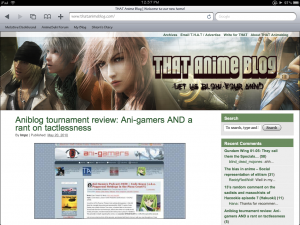
Both designs are pretty clean and view properly on the iPad. However, I find that on Ani-gamers, the sidebar on the left could be a bit awkward as most blogs have them on the right. Otherwise, there isn’t really much to comment on design.
Match 15 Verdict: THAT Anime Blog
Match 16
Nigorimasen! Vs Anime Instrumentality
Content: The problem with Nigorimasen is that there isn’t much content on the blog as most of the posts are news posts. As easy as posting news sounds, it gets very annoying because we get sites like alafista and company pollute AnimeNano. People would most likely read the news from Anime News Network anyway, so the purpose of posting news on a blog is pointless. Anime Instrumentality is a very unique blog focusing on music, which I actually subscribe to because I like their reviews.
Design:
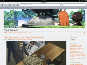
Nigorimasen has a clean design… However, Anime Instrumentality needs a bit more work on their theme since, well it doesn’t look as appealing, but it is not as important.
Match 16 Verdict: Anime Instrumentality
Day 9
Match 17
Random Curiosity vs Behind the Nihon Review
Content: It’s the battle between the episodic and editorial blogs. As you well known, Random Curiosity is the standard in episodic blogging. However, the standard have a bad influence on new bloggers as they will copy their style and well, we end up with a flood of bad episodic blogs. It is best to avoid summarizing the episode too much and add more of your own content. Behind the Nihon Review has interesting editorials, so I vote for them on preference.
Design:
Not much I can say about the designs as they are good.
Match 17 Verdict: Behind the Nihon Review
Match 18
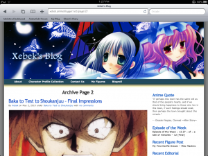
Xeblek’s Blog vs Listless Ink
Content: Not much to say about Xeblek’s Blog. Most of the content I see is impressions posts with some episodic blogging. I don’t know, but after seeing so many episodic blogs, they seem to get a bit bland. Listless Ink on the other hand have a bit more appeal to their posts compared to Xeblek’s Blog. Xeblek’s Blog just really needs more unique content to make them stand out more.
Design:
Not much to comment here since both banners are pretty artsy. However, I find Listless Ink’s layout pretty odd since everything is on the bottom, but it works out all right in the end.
Match 18 Verdict: Listless Ink
That wraps up the AntiBlog Tourney Round 2 Part 3 digest. Stay tuned for Part 4 when I will be reviewing 12 more blogs.



I really really do need to do something about the layout. If you’ve any thoughts, do feel free to pass them along since I just picked that theme up pretty much on a whim.
.-= zzeroparticle´s last blog ..Reminiscing over the Decade’s Anime Music – 2006 =-.
If you have some HTML and CSS skills, you can try to hack it out with the Thematic Theme Framework (link is on the bottom of the page). The pros of this is that it supports the latest WordPress features like comment threading and such. It took me an hour however to make it look as what I wanted.
Or you can get a child theme for Thematic and then modify it to your liking.