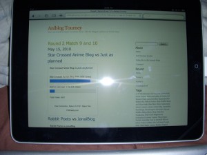
I got a bit sidetracked yet again with the iPad. I decided to get one and it works great so far… and I got distracted and yeah… forgot about the AniBlog Tourney…
Since I have a real iPad now, I will review blogs on my iPad instead. Like the last digest, blogs will be judged on content and design with content weighing more.
Day 4
Match 7
hontou ni vs chaostangent
Content: Hontou ni is mostly an editorial blog with some episodic posts that redirects to Sea Slugs as the author of this blog is a writer for them. They are both well written blogs, so they are pretty much comparable with chaostangent being slightly better. I prefer his post styles since it is sort of odd to redirect your posts to another blog, but whatever.
Design:
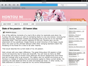
The problem with hontou ni’s design is that the date gets cut off of the iPad screen. Although the design looks okay, it is not a very good idea to have anything outside of the main layout as content can be cut off. With the popularity of tablets such as the iPad, blogs should be properly formatted for all devices, not just desktop browsers. chaostangent’s design loads properly and looks better in my opinion. My suggestion for hontou ni is to get another theme or design your own that will load properly on a 1024×768 screen like the iPad’s.
Match 7 Verdict: chaostangent
Match 8
OGIUE MANIAX vs Caraniel’s Ramblings
Content: Both blogs are well written, but OGIUE MANIAX’s editorials simply stand out more, so it has an advantage over Caraniel’s Ramblings.
Design: Can’t comment since both of them are WordPress.com blogs.
Match 8 Verdict: OGIUE MANIAX
Day 5
Match 9
Star Crossed Anime Blog vs Just as planned
Content: Star Crossed is an episodic blog, but they do things right besides the typical synopsis and thoughts post as he go in depth on the episodic content. Just as planned is an okay blog, but I think the content needs to be improved a little bit more and also update more. Star Crossed Anime Blog seems to outpaced Just as planned in the number of updates as well…
Design:
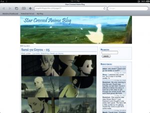
Both designs are very clean, but I think Just as planned needs a banner. Simply having the title on your blog is simply not enough these days…
Match 9 Verdict: Star Crossed Anime Blog
Match 10
Content: Both blogs are good. One is a mixed editorial/episodic blog and one focusing Anime in the West. There isn’t much I can say as they are both good blogs, although I don’t really care much about the convention stuff…
Design:
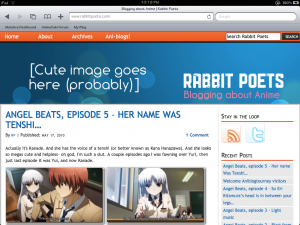 I take that comment back from the review of Janaiblog in Round 1. Rabbit Poets have a better design that is more appealing. Janiblog’s design is a bit bland and doesn’t view properly on the iPad as when you scroll the page, the background turns black. This is because fixed backgrounds on the iPad don’t work properly. My suggestion for Janai Blog is to get a new theme and also make a banner. It’s quite rare to see a blog without a banner since most of the time, it is the selling point.
Match 10 Verdict: Rabbit Poets
Day 6
Match 11
Wakaranai vs Canne’s anime review blog
Content: Wakaranai seems to update more frequently than Canne, but the problem here is well… too much episodics and not much editorial writing. Canne does not update often, but the content stands out more. Also, I found that the writing style of Wakaranai to be a bit awkward as bullet points are not normally used to show your thoughts.
Design:
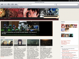
When you use the slogan, never call Anime “Animu.” For some people, they might find that annoying and pretty childish. Its Anime, not Animu! The search field is a bit off because I’m using a iPad to review these blogs and can be viewed as a mess. The navigation is messy and somewhat difficult to navigate. My suggestion for Wakaranai is to first get a better theme that would be easier to navigate so people don’t have to go through the frustration on looking for a post to read. Second, they should really redesign the banner since it doesn’t look that great. Lastly, don’t use the word “Animu” please.
Can’t comment on Canne’s anime review blog design since it is a WordPress.com, but believe me… it is a lot cleaner and easy to navigate compared to Wakaranai.
Match 11 Verdict: Canne’s anime review blog
Match 12
Crystal Tokyo Anime Blog vs Beta-Waffle
Content: The problem with Crystal Tokyo Anime Blog is that it does what every typical episodic blog does. Don’t spend too much on synopsis! The author needs to spend time on what he/she thinks about the episode and add something interesting. Everyone is already going to see the episode already, so there is no need to retell the story. One paragraph on summary is enough to get the reader in the right direction when you talk about your thoughts about the episode. Beta-Waffle is mostly comics as I said in my last review, so there isn’t much to talk about this one.
Design: Again, I can’t review the design of WordPress.com blogs since it wouldn’t be fair. However, Beta Waffle’s color choice is a bit meh, but it is all right.
Match 12 Verdict: Beta-Waffle
That wraps up Part 2 of the AntiBlog Tourney Round 2 Part 2 digest. Stay tuned for Part 3 when I will be reviewing 12 more blogs.


Hoho, reviews from a iPad, this’ll be good o/
and lol about animu; personal preference or not I guess [shrug]
.-= Aorii´s last blog ..Accepting Your Other Self: From Shugo Chara to Arakawa =-.