Sorry for the long delay… I was caught up with final exams that happened on the first two days. On Wednesday, Steam for Mac was released and it came with free Portal, so I spent my time playing Portal and moaning about sacrificing my Weighted Companion Cube. I just beated the game when I totally forgot about the second round… so yeah.
In this round, I will do things a little differently. Instead of reviewing them individually, I will review them basing on content and layout/design. Content weighing a lot more than the layout/design. This will make things run a bit more smoothly.
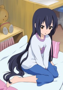
Note: The fanart used above is made by えらんと
Day 1
Match 1
Sea Slugs! Anime Blog vs Calamitous Intent
Content: Calamitous Intent is mainly about Visual Novels. However, there isn’t much content beyond that except a lot of pictures and stuff…
Sea Slugs! Anime Blog for what I see is a well written Team Blog. However, the synopsis is a bit too long. Most readers should have already seen the episode, so there isn’t much point to have it so long. One paragraph on the most important events is enough to get what the author is saying. Otherwise, the content is top notch.
Design:
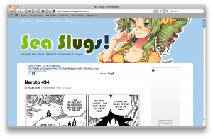
Again, SeaSlugs have an advantage with this one as their layout is pretty creative and looks clean. My gripes is the links on the top is a bit hard to read since the links are white on a baby blue background. I suggest using a darker color so I can read it.
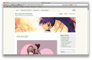
The problem with Calamitous Intent is what I see with other WordPress.com… They limit what you can customize and leaving you having to use the same theme as everyone else. WordPress.com should really do something so blogs don’t look like the same as other blogs. The only choice at the moment is to switch to a self hosted WordPress blog that allows for more customization.
Match 1 Verdict: Sea Slugs! Anime Blog
Match 2
Kitsune’s Thoughts vs The Cart Driver
Content: Kitsune posts on variety of subjects, but the problem is that in some of the content, it is mostly pictures. The Cart Driver I have previously reviewed simply had better content and posts far more often. The problem with Kitsune’s Thought is too much videos and pictures and less actual content. Perhaps they need to do more in their posts than just simply adding a lot of pictures and/or videos with few sentences of text.
Design:
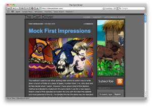
Although the design looks appealing on “The Cart Driver,” I would probably liked the design more if it had a big banner as a small image on the right simply isn’t enough. I’m sure Scamp can fit a banner someplace, but this is my only complaint.
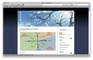 I liked the design on Kitsune’s Thoughts since it was clean and pretty.
In the end, the vote goes to The Cart Driver simply because of stronger content. I think The Cart Driver could use a banner or to. Kitsune’s Thoughts need to work on content and do less of the slapping of a lot of images in one post.
Match 2 Verdict: The Cart Driver
Day 2
Match 3
Content: We Remember Love is a well written blog that seems to have very long editorial posts on various subjects. The problem I see with Hanners’ is that with the episodic, a bit too much summarizing. I would rather focus on specific sections of the show which I found funny or interesting or even add something unrelated to the show. Hanner’s also reviews singles related to Anime, but meh…
Design: Not much to comment here. However, as previously mentioned on my review of Hanner’s blog in the first round and the Round 1 Followup, Hanner’s banner is way too big. Anime Princess had the same problem, but she is finally addressing it. Hanners’ really need a smaller banner within the maximum, 960px in width and 300px in height. It becomes a pain when you want to view posts in full because you have to do even more scrolling.
Match 3 Verdict: We Remember Love
Match 4
Content: The content here is night and day. Baka-Raptor is a satire blog which I found most of his posts very funny and he has a good sense of humor. Paper Flower is completely different and a bit more formal. However, I find the content more enjoyable from Baka-Raptor, so it has a slight advantage over Paper Flower… This doesn’t mean Paper Flower is a bad blog as it is a very good blog, but I prefer the jokes from Baka-Raptor since his Round 2 post cracked me up more than Paper Flower’s.
Design: The problem with Baka-Raptor’s design is the clashing colors. Dark brown text on a black background pretty much shows that the whole website has a bad web designer. I liked Paper Flower’s design better since it is a lot cleaner, but if Paper Flower was on a self-hosted WordPress, they could use the design to the full potential like mefloraine with the help of Gargron with Paper Dream.
The vote goes to Baka-Raptor because his post is humorous 99% of the time, although he should really work on the design.
Match 4 Verdict: Baka-Raptor
Day 3
Match 5
Content: One is an Episodic Blog and the other is a satire blog. Although I can say, Tenka Seiha have slightly better content and I have to commend them for not summarizing the whole episode. However, you may find their posts somewhat annoying because he seems to say “AAAAAAAAanyway” in some of his posts. Most of the posts on Open Your Mind however isn’t as annoying, but there isn’t much content to begin with… So yeah.
Design:
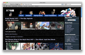
Not much I can say about the design of Tenka Seiha as it’s rather plain. Another problem I see is the lack of a cloud and archive widget. How can people forget those!
Can’t really comment on the design of Open Your Mind since it has all the limitations of WordPress.com, although I like the banner.
Match 5 Verdict: Tenka Seiha
Match 6
Borderline Hikikomori vs 2-D Teleidoscope
Content: The problem I see with Borderline Hikikomori is that the blogger summarizes way too much on the episodic posts, which is a bit too excessive. The major weakness these episodic blogs is that they summarize way too much and only leave one paragraph for the thoughts. Borderline Hikiomori should focus more on what they think about the episode. Perhaps picking out favorite scene and talk about them and the such. My review of 2-D Teleidoscope remains unchanged and has an advantage over Borderline Hikikomori.
Design: There is not much I can say about the designs as they are both WordPress.com blogs…
Match 6 Verdict: 2-D Teleidoscope
Okay, this pretty much wraps up the first digest in the second round. Expect the next digest be posted in a few days. Hopefully I won’t be sidetracked like I did with this one.

